Scientific progress takes shape in ESMO’s new visual image with Armando Testa Design.
Following an international pitch, ESMO, the medical oncology society, has chosen AT Design – the packaging and branding unit of the Armando Testa Group – as its strategic and creative partner for its rebranding project.
Since 1975, ESMO has been active worldwide in the fields of medical oncology and cancer care, promoting and supporting medical excellence through training, research as well as drawing up international guidelines.
With this rebranding journey, ESMO aims to renew its visual identity to reflect its open and global vision of medicine and care.
Once the project’s international scope had been defined, and ESMO’s objectives clarified, AT Design started the rebranding process using its tried-and-tested methodology, which combines strategic thinking, vision, creative synthesis and collaborative empathy.
The strength of this process is that it integrates brand analysis and the creative translation of strategic insights into a continuous flow of interaction, enriched thanks to constant feedback with the client.
The strategic brand analysis phase was entrusted to the AT Brain unit which, through an approach that is first analytical and data-driven, and subsequently design-led, defines the brand’s territory and its corresponding expressive code. More specifically for this project, the strategy highlighted the need to consolidate ESMO’s role as a benchmark, capable of orienting the most complex decisions through an authoritative and reliable perspective for all 53,000 members and the entire scientific community. This central role is expressed visually in the new logo and brand image, designed to convey how a sound and rigorous scientific approach translates into concrete solutions for oncological pathologies.
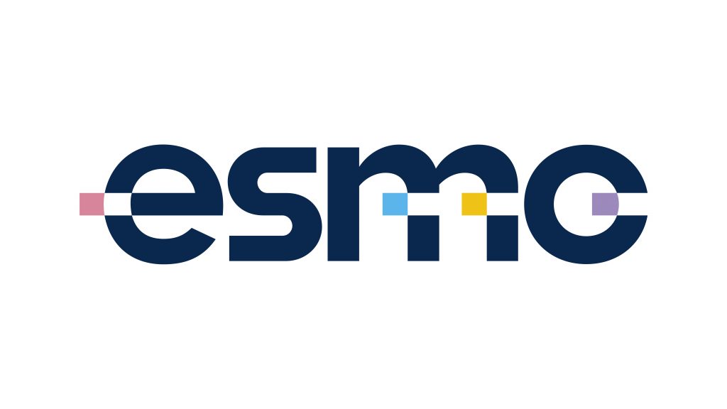
The creative interpretation of the positioning is expressed through a logo with immediate impact: essential and versatile lettering reflect the concept. Coloured squares are extracted from the outlines of the letters, as if part of the logo were deliberately being left behind. This represents a metaphor for scientific progress: whilst ESMO helps to advance research and treatment, cancer gets left behind.
The result is a striking and dynamic symbol that encapsulates, in a single graphic gesture, the movement, the vision of the future and the constant drive to be at the cutting edge that define the organisation.
The new visual identity, officially presented at the ESMO Congress 2026, will come into effect from 2027, setting out ESMO’s expressive style for years to come.
Credits
Agency: Armando Testa Design
Head of Client Service Milan: Emanuele Cicogna Mozzoni
Client Service: Arianna Cipolloni
Creative Direction: Roberto Gresti
Creative Team: Lara Aldrighi, Delia Laviola
Strategic Team: Arianna Nicoletti